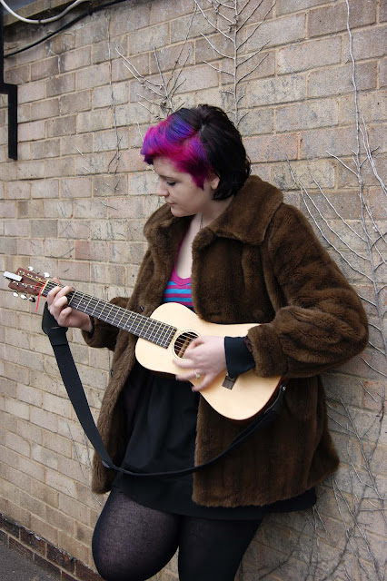
Front cover
This is the original image for my front cover. However I rotated
the image so the model looked as if she was making direct eye contact with the
reader to make the magazine more personal as with the eyes being on eye level
the image directly addresses the reader. I also made the light levels on the
image darker so the image looked more vivid and clear.
Insert images
These are the original image for my insert images for my front page. By using insert images it shows that my magazine has a variety of features that relate to the magazine and audience.
Contents page
This is the original image for my contents page. However I
cropped this image to get rid of unwanted extra space on the image to create
more focus on the model. I also changed the light levels so the image was more
vivid and clear. I used this image for the contents page as it relates to my
double page spread and draws the reader in to reading to article.
Editors image on contents page
This is the original image for the image of the editor of
the magazine on the contents page. I cropped the image to make it smaller and
to get rid of extra space on the image; also I adjusted the light levels on the
image to make it brighter. I decided to add in an image of the editor to give
the magazine a personal touch and it complements the editor’s letter on the
contents page.
DPS image
This is the original image for my double page spread. However
I rotated the image so the model was on eye level with the reader, making it
feel more personal. I adjusted the light levels on the image also to make the
image darker so it was clearer to see. Also as the image is similar to the
image on my contents page when readers are looking though the magazine they
will notice the image and relate it to the information on the contents page.


No comments:
Post a Comment